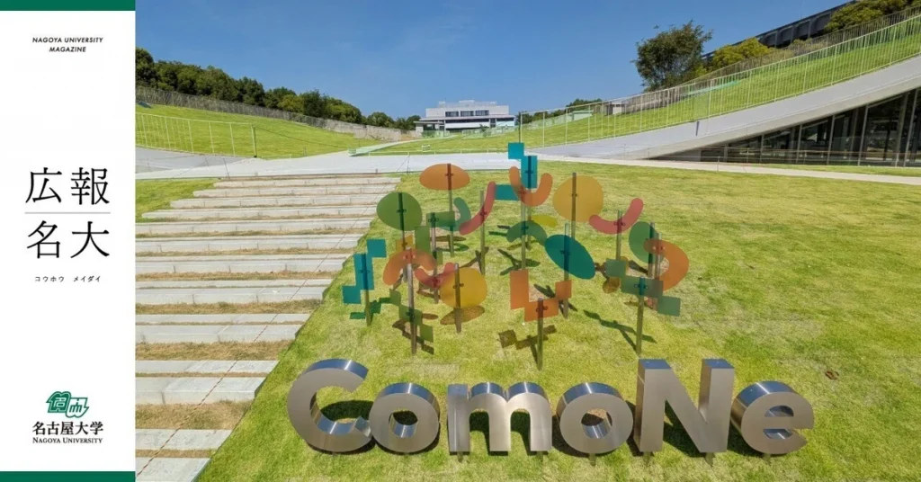
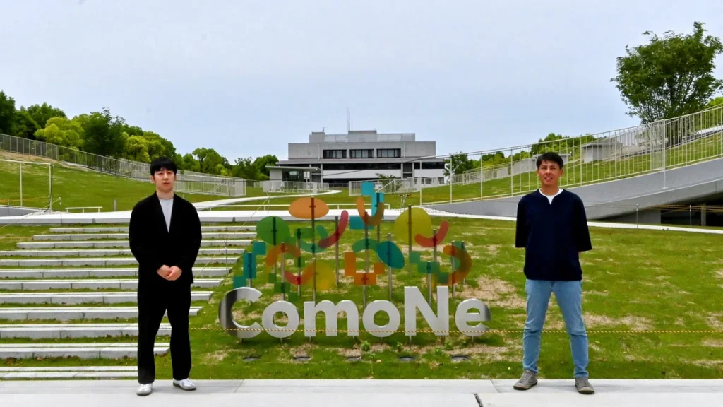
The Common Nexus (ComoNe) logo is strange, complex, and entirely unique. Its different colors and shapes overlap and intersect, forming a single cluster. A three-dimensional rendering of the logo hangs from the ceiling inside the facility, and another sits outside the front entrance, welcoming visitors to ComoNe.
We sat down and spoke with the minds behind the logo: the concept developer and the designer.
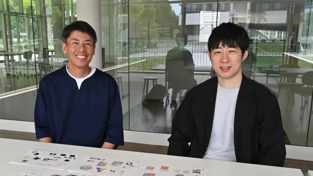
Director of concept development in the creation of the logo
(Right) Designer, Arata Takemoto / Arata Takemoto Design Office Inc.
Produced a variety of designs for ComoNe, ranging from the logo itself to facility signage
Linking back to ComoNe’s core concept—the key phrase was “diversity in the soil”
Matsui: The first stage of the logo design was a concept generation phase. This was conducted by a specialized team with a thorough understanding of ComoNe’s objectives and its operational policy.
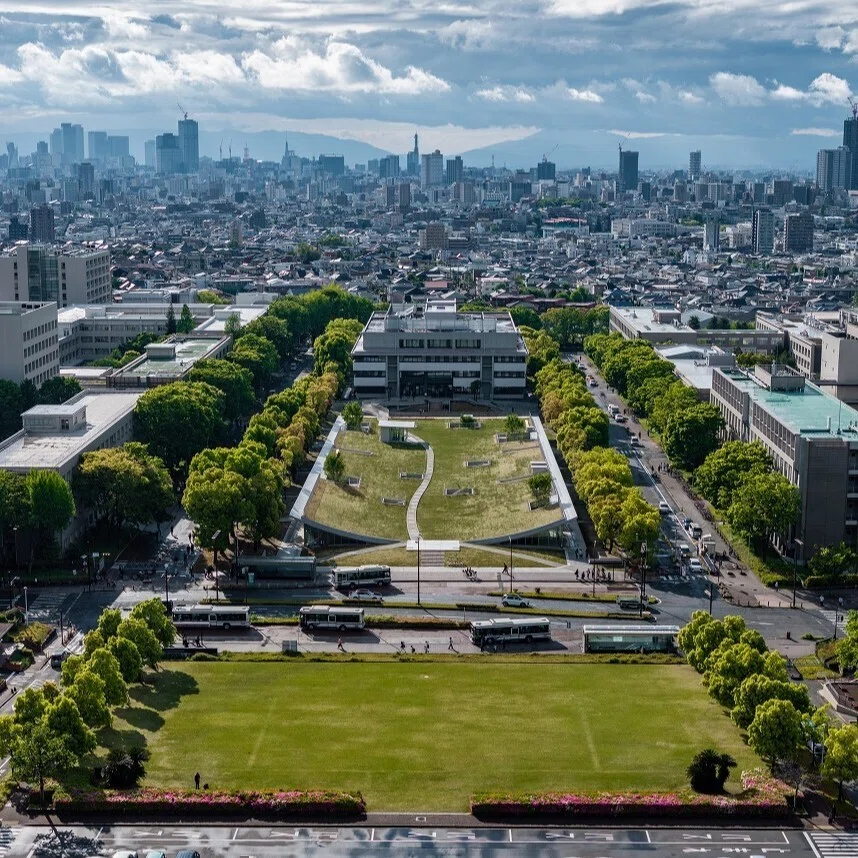
ComoNe’s conceptual basis is a “co-creation space” where various members of the Tokai National Higher Education and Research System (THERS) and the wider community can come together and interact. Key concepts that govern the facility’s operation include “creating a space like an ecosystem” and “mixing and intersecting.” In addition, Tetsuo Kobori, the architect who designed the facility, described his design as looking “like the ground has been peeled back,” and so, on both the physical and conceptual levels, we arrived at this idea of being “in the earth.”
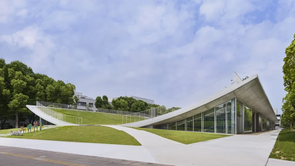
Takemoto: Initially, the planning team considered the keyword “ambiguity” and thought about images where a diverse mix of people are all jumbled together and blend into each another, as well as coming up with ideas such as a visual representation of the building’s architectural design that looks like the ground has been peeled back. There was also the idea of creating a logo using letters alone, and so most of our initial ideas were quite different from the logo we ended up with [laughs].
Matsui: To be honest, I did feel a sense of pressure, thinking that the universities wouldn’t approve any of our designs [laughs].
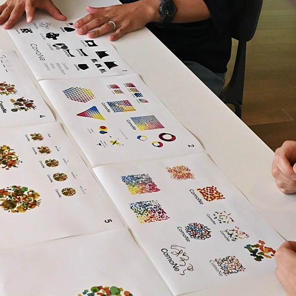
Takemoto: After that, words and phrases such as “in the soil” and “ecosystem” came up, and so we gravitated towards a design that embodied an organic, circulatory process consisting of different interdependent parts. Somebody came up with the idea that we should begin by looking at soil, and so the two of us actually looked at some earth under a microscope.
Matsui: That’s right [laughs]. It was easy enough to say “ecosystem,” but it was difficult to imagine what that would look like design-wise. We wanted to be more intuitive—hence the decision to look at soil.
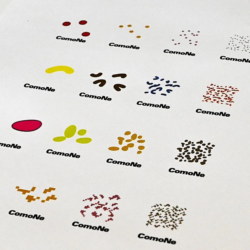
A unique logo is born
Matsui: Sign design is a kind of subtraction or paring away: you take complex information and try to make it as abstract and simple as possible. This is to make the sign clear and memorable, and to make it stand out. However, with this design, I was assertive in my proposal that it could be interesting to layer all the design elements on top of each other.
Takemoto: Prior to this project, I had always stayed true to the method of paring something away and leaving behind only its essence, so when the proposal to “layer everything” came up, it didn’t feel quite right – a bit like an allergic reaction, perhaps [laughs]. However, this in itself was a breakthrough: I realized that paring away is just one of many solutions.
Clean design is nice in its own way, but it sometimes fails to leave an impression on the viewer. I think that a sense of eeriness or uncanniness can, in fact, also be an important aspect of design.
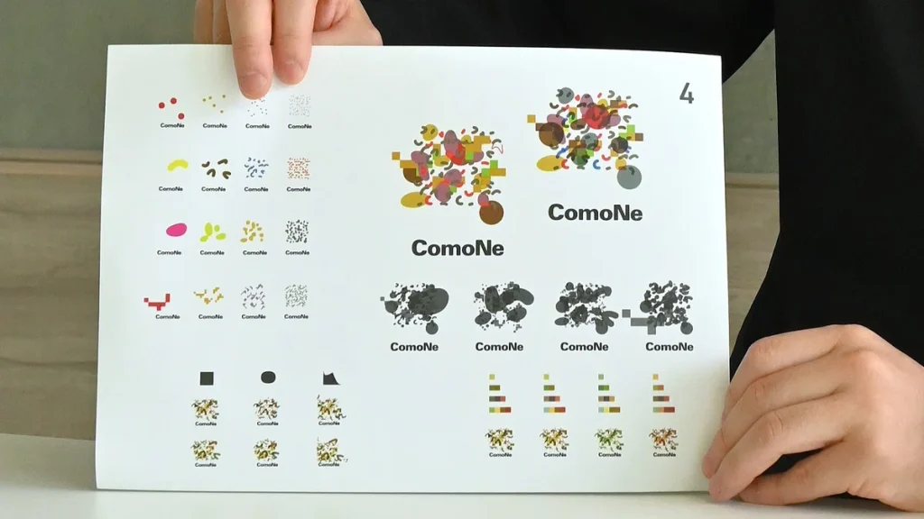
Colors and shapes changing infinitely—what we want to happen at ComoNe
Matsui: For most people, “the color of soil” typically means the color brown. However, when you look at soil under a microscope, it is not brown at all: there are minerals, microorganisms, earthworms, each with their own color and shape. Focusing on these various aspects, you realize that soil is in fact full of color, and this realization factored into our design.
Takemoto: We used a method called “multiplication” in which multiple colors and shapes are layered, and the overlapping parts make new colors.
Matsui: There is significance in the fact that new colors emerge where the different shapes intersect. When you come to ComoNe, you yourself undergo a change: new colors come through, if you will. Colors overlapping many times in multiple layers resulting in unpredictable new shades—I think that’s what ComoNe is all about.
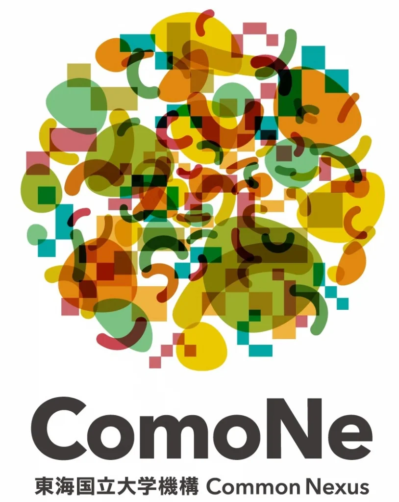
Takemoto: The logo we created contains various elements, and depending on the viewer, these elements might look like microorganisms, or seeds, or earthworms, and I think it’s right that different people should perceive these elements in different ways. I thought we should include digital elements in addition to natural ones, so we also incorporated geometric artificial-looking elements.
Matsui: In retrospect, I think the actual process of creating the logo embodied the essence of ComoNe. The logo mark is an expression of what we hope will occur at the facility. Of course it’s ideal when different people’s worldviews align, but we hope that ComoNe will create abundant opportunities for people of different personalities and backgrounds to come together and be changed by their encounters with one another.
Originally published in Japanese on July 29, 2025.